 Our experimental results support the conjecture that every non-rational
algebraic number is normal; more precisely, we have found no evidence
against this conjecture. In this section we will describe how we looked
at and interpreted the experimental data to arrive at this conclusion.
We include only a few examples of how we looked at the data here. In
fact, we have only looked at certain aspects of normality and
randomness in decimal expansions. Thus our results may be interpreted
more narrowly to support the hypothesis that algebraic numbers are
normal base 10. A
full description will be found in [3].
Our experimental results support the conjecture that every non-rational
algebraic number is normal; more precisely, we have found no evidence
against this conjecture. In this section we will describe how we looked
at and interpreted the experimental data to arrive at this conclusion.
We include only a few examples of how we looked at the data here. In
fact, we have only looked at certain aspects of normality and
randomness in decimal expansions. Thus our results may be interpreted
more narrowly to support the hypothesis that algebraic numbers are
normal base 10. A
full description will be found in [3].
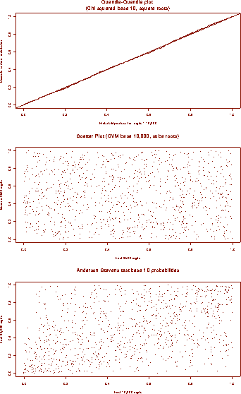
Our main goal here is to give a quick visual summary that is at once convincing and data rich. These employ some of the most basic tools of visual data analysis and should probably become form part of the basic vocabulary of an experimental mathematician. Note that traditionally one would run a test such as the Anderson-Darling test (which we have done) for the continuous uniform distribution and associate a particular probability with each of our sets of probability, but unless the probability values are extremely high or low it is difficult to interpret these statistics.
Experimentally, we want to test graphically the hypothesis of normality and randomness (or non-periodicity) for our numbers. Because the statistics themselves do not fall into the nicest of distributions, we have chosen to plot only the associated probabilities. We include two different types of graphs here. A quantile-quantile plot is used to examine the distribution of our data and scatter plots are used to check for correlations between statistics.
The first is a quantile-quantile plot of the chi square base 10 probability values versus a a discrete uniform distribution. For this graph we have placed the probabilities obtained from our square roots and plotted them against a perfectly uniform distribution. Finding nothing here is equivalent to seeing that the graph is a straight line with slope 1. This is a crude but effective way of seeing the data. The disadvantage is that the data are really plotted along a one dimensional curve and as such it may be impossible to see more subtle patterns.
The other graphs are examples of scatter plots. The first
scatter plot shows that nothing interesting is occurring.
We are again looking at probability values this time derived from the
discrete Cramer-von Mises (CVM) test base 10,000. For each cube root we
have plotted the point  , where
  is the CVM base 10,000
probability associated with the first 2500 digits of the cube root of
i and
is the CVM base 10,000
probability associated with the first 2500 digits of the cube root of
i and  is the probability associated with the next 2500
digits. A look at the graph reveals that we have now plotted our data
on a two dimensional surface and there is a lot more `structure' to be
seen. Still, it is not hard to convince oneself that there is little
or no
relationship between the probabilities of the first 2500 digits and
the second 2500 digits.
is the probability associated with the next 2500
digits. A look at the graph reveals that we have now plotted our data
on a two dimensional surface and there is a lot more `structure' to be
seen. Still, it is not hard to convince oneself that there is little
or no
relationship between the probabilities of the first 2500 digits and
the second 2500 digits.
The last graph is similar to the second. Here we have plotted the probabilities associated with the Anderson-Stephens statistic of the first 10,000 digits versus the first 20,000 digits. We expect to find a correlation between these tests since there is a 10,000 digit overlap. In fact, although the effect is slight, one can definitely see the thinning out of points from the upper left hand corner and lower right hand corner.
![[Shownotes]](../gif/annotate/sshow-151.gif)